Friday, March 30, 2012

Got milk?!

Ok so I'm not talking about mustache-making milk but our NEW and cute Milk Cartons!  You get two of these for just $4.95.  They are a good size, perfect to hold any small "treat", and come with clips for easy closure.
They have become one of my favorite new products and I have been adding a package onto each order so far!  They are perfect for any occasion...birthday gifts, party favors, a little thank you for that someone special... 

You can view them on my website by clicking here.  Let me know if you would like me to order some on my next order for you or you can purchase directly from my website!

I love milk...cartons!  :0)

Thursday, March 29, 2012

Altered & organized!

In just a few days our new Close To My Heart letters will be sent to those in our customer database.  It is beautiful, professional-looking and full of useful information.

I have been pondering a way to manage my customer contacts so that I can not only add new customers to necessary databases but also have them accessible for quick access.  I have debated numerous options and then remembered... DUH!  I bought an alterable wooden "rolodex" a couple of months ago so why don't I use that?  And I did...  So it went from this...
 to...(drum roll)...THIS!  
Isn't it much prettier?  I should hope so!
I painted everything but the underside with white acrylic paint and used our lovely and discontinued Sophia paper to decorate it.

I alternated the tabs between cardstock colors: Pear, Hollyhock, Blush and Honey - all paper that coordinate with the Lucy paper packet.  Then I used our exclusive Cricut Art Philosophy Cartridge to create the scalloped tabs and some retired letter stickers from non-other than CTMH!
I am absolutely proud with how it came out and will look forward to adding new contacts as I seek opportunities to receive them. I hope you like it as much as I do.

Still lovin' Sophia,

Wednesday, March 28, 2012

1997 NM - State Cheerleading Champs

So one of my other passions (although a little outgrown from it) is cheerleading.  It was ingrained from me at an early age as my dad was a high school basketball coach.  There my sister and I were...on the sidelines...cheering the team onto victory.  Of course, my Mom had a play in this in that she made us the most adorable, and homemade cheerleading outfits and we were well-accepted by the high school cheerleaders.  We were always "one of the girls". 

I have fond memories from those days and have experienced many great things throughout my cheerleading career.  I cheered in middle school, high school and college, worked on summer camp staffs, and have coached numerous squads over the years.  All have been rewarding experiences (ok...not all have been) but most have been very enjoyable.


I have had this photo since 1997 and have put it in frames and such but have never taken the time to scrapbook it.  Two weekends ago I did just that!  I didn't want to take away from the photo so I used a little bit of Pemberley B&T - bottom strip - a border from the Pemberley Stickease, some of our new Sparkles, a paper flower and a Bigger Brad.  Of course, I feel that the Felt Alphabet letters made the right impression with a stark and bold title. 

This photo was taken at the State Cheerleading Championships at The Pit in Albuquerque, NM.  My squad (I was the head coach) took 1st place in AAA and it was a huge accomplishment for me, my staff and the girls.  It was a blessed time and I can almost remember the exact emotions that took place when we heard them call out our squad name.

My alma mater has had a rich tradition in cheerleading over the years and it is an honor to have become part of that legacy as a Head Coach.  (I was also a State Champion in cheerleading as a cheerleader my Senior Year and as an Assistant Coach three other times.)

Thanks for introducing cheerleading into my life, Mom and Dad.  It placed some valuable experiences in my life that I will never ever forget.

Cheers!

Sunday, March 25, 2012

20-Year Reunion Layouts in Studio J (and some cool videos)

If you recall, I hosted my 20-year class reunion this past summer and I am embarrassed to admit, but will, that I had yet to scrap any of the pictures.  That was...until yesterday...

I figured that while watching March Madness I could sit with my laptop and create at least one layout and I did, in Studio J! 
I actually used the Boom-Di-Ada paper packet to create this layout.  It is a retired paper packet and if you remember what it looked like you might say, "No way!"  Yes way!  With the "magic" that you can bring to life with Studio J, I was able to change out the cardstock and B&T paper as I saw fit for the photos and the occasion. 

If you look closely, the black floral B&T easily visible in the bottom portion of the left page...it really defaulted as a "turquoise" background with pinks and purples splashed throughout.  It is AMAZING what potential there is in Studio J and I did not have a messy workspace when I was done nor any scraps to have to sort through.

If you have not checked out Studio J, please visit this link as located on my website.  You will find lots of helpful information there or you are welcome to contact me with any questions you have. 

If you visit Studio J through the corporate site, you will find an array of how-to videos located there.  You will be AMAZED at the different techniques you can use with this awesome online program.

I watched this video yesterday, showing me how create patterned paper in Studio J. I used a couple of techniques highlighted in that video on the layout shown above.  So, why not check it out?

Watch this video by clicking here.

While papercrafting by hand is my preferred choice of scrapbooking there is definitely a place for Studio J and for that reason...I love it!

Saturday, March 24, 2012

Spring is here!

It is an absolutely beautiful day here in Dallas!  Everything is so green here as we have received lots of rain over the last two weeks.  And...bluebonnets are in full bloom everywhere!

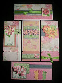
The gorgeous weather has put me in the mood for some spring cards and what better paper packet to use than Lucy?  It is my absolute favorite from this Idea Book.
I taught these 5 cards to my Club on Thursday night and they loved them!  They are definitely much more beautiful in person but, you get the idea.

They are made with our NEW 8 x 3 1/2 Colonial White Diecut Cards and Envelopes.  They come with a "flap" but I did elect to cut that flap off of two cards because of the design of the card front.  They were fun and different to use.  You can click here to view these cards and envies.

I hope you are enjoying a beautiful, spring day wherever you are!

Thursday, March 22, 2012

Life is Beautiful!

Some time back I posted some photos of my horse-riding experience.  I was blessed to share in this opportunity with my hubby who had me cracking up while sitting on a horse!  It was hilarious!   I have always wanted to ride a horse but just hadn't been given the opportunity.  That day was the day!
I used these layouts from Mayberry (a retired but CUTE paper pack) to commemorate this event which I can now check off my bucket list.

I did have another "pose" of my hubby that I didn't want to not include, but also didn't have room for, so I used a Flip Flap under the left photo.  It allowed me to include a photo under that photo without having to create another page.

If you aren't sure what a Flip Flap is, just ask! You'll absolutely love them once you've tried them!  You can see how they become interactive as shown below.


Life IS Beautiful!

Tuesday, March 20, 2012

Time to Celebrate!

We brought in the New Year this year at church and had a grand time with worship and God's word.  Corey and I had fun taking some pictures to commemorate us ringing in 2012, a year of anticipated blessings.
I used layouts from an exclusive You & Me promotion from Close To My Heart, from some time back.  Our photos went perfectly with this paper packet and I love how they turned out.

Praying you have started out 2012 in a positive way! 


Thursday, March 15, 2012

Technique Blog Hop - MARCH

This technique had me a little thrown initially until I realized I have used it more than I realize.  Some B&T papers lend themselves better to creating our own embellishments - for cards or layouts - but with a little creativity...

This month we were asked to highlight the technique on page 21 in the 2012 Spring/Summer Idea Book called, "B&T Duos Designs as Embellishments".  (We get twice as many choices since our B&T paper has a different pattern on each side.)  There are 14 of us participating in this hop so if you have come from Tonya's Blog you are on the right track.  You can view a list of the participants and begin the start of the hop by visiting Michelle's Blog.  In any case I hope you enjoy the blog and be sure to join us in highlighting this technique and having the opportunity to win some CTMH goodies.  You can find complete details by clicking HERE.


Using a Twilight B&T pattern for the base of this circle card, I then selected two images from the beautiful striped sheet of paper shown below (left).  Directions for this technique state to select portions of the B&T to use, trim the pieces, and adhere to project. I did just that, incorporating our new Florentine paper packet. I also took a piece of one of the stripes to create the heart stripe at the top of the card.

I made the dimensions 3-D by placing 3-D Foam Tape under each image and added some of our Mocha Opaques. 


I am pleased with the results and hope you agree!  Now, hop on over to Shirley's Blog where you will find another variation for this technique.

Be sure to check out our Techniquely Terrific Blog and participate in a fun challenge using this technique.  YOU COULD WIN SOME CTMH PRODUCTS!  Click here for more details.

Happy hoppin'!